Sunday, 2 February 2014

Q4

How did you use new media technologies in the construction and research, planning and evaluation stages?

Through this project I have learnt a lot of new and different techniques. For instance, I had never used Final Cut before the beginning of this coursework.
In the planning stages I got the opportunity to use Twitter, Facebook and a Gabrielle Aplin fan site to find out from her fans what they really wanted. I figured this would be the easiest way to reach them as our target audience is 11-18 year old females, majority of which will be available on some form of social media. Therefore, we wrote questionnaires for the fans online and luckily managed to get responses! To get all the different digipaks, magazine posters and videos to analyse we had to do a bit of searching. The digipaks were just CD's I had at home, the posters and videos slightly harder to find. The videos we got off YouTube, after looking on Google for the top 40 folk pop/ indie artists. The posters were harder to find, after looking through a lot of music magazines and realising that the adverts in them weren't quite what we were after, we had to dig into the darkest corners of Google again to find ones similar to the image that we had in our heads that we wanted to create. Luckily we managed to get everything we were after which leads to the construction stage of the process.
For this, we needed to use all of our skills when it came to creating a believably real product. Photoshop was used on the digipak and the magazine poster to make the images and layout as professional as possible; and the well known website 'Dafont' certainly helped us pick a style of writing suitable for the genre. Wonderfully there was a design template already available for the layout of the digipak so we didn't have to make that completely from scratch but we did have to figure out how to fit certain things on and how (for example) we made the back of the digipak an earthy green that then blends into the photograph used. This was certainly a new technique used. These images then had to be screenshot- as we learnt the hard way that the files were far too big to just upload to Blogger.
The creation of the actual music video must've been the hardest part. Final cut seemed daunting and hard to use, especially with all our little random bits of footage we shot for the video. However, once you started using it a lot and realised what at least half of the options were it became manageable and at points, fun to use! There were so many different options for frame transitions, or where to put the sound within the video, or which parts needed to be rendered and when that we had all the necessary equipment at our disposal to create the perfect A level music video.
Overall, I used so many more media technologies to advance this project in every way, and even just reusing Photoshop meant that I learnt more about the different techniques available on it. They all helped create that glossy look to the product, a more professional approach and design compared to if I had just made it in a few seconds on Word.


a few examples of the media technologies used.

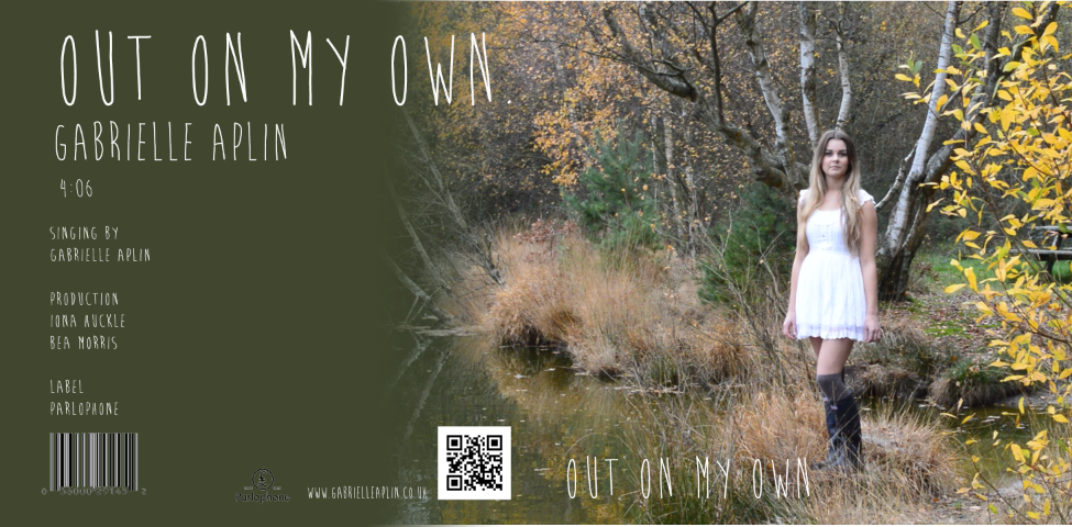
Updated digipak


We made some changes to the digipak after hearing how we could improve it. This is the final design. The changes that we have made include:
  • Adding a white spine with the artists name and the song title on it
  • Shadow has been added to the writing on the front cover and it has been made larger
  • We changed the shade of green used on the back of the digipak as it was noted as being too 'mossy' before
  • Moving the QR code and changing the size of the parlophone logo as well as the positioning (so that the spine can fit in better)


Q3

Q2

How effective is the combination of your main product and ancillary texts?

We have successfully managed to combine the:
  • Music video 
  • Magazine advert
  • Digipak
Similarities
  • We have used the same font on both the magazine advert and the digipak as a way to link them- a font called Brain Flower
  • We also have the artist in the same Alice in Wonderland costume on all three texts 
  • The photo shoot and the video are shot in the same location
  • There are references to the song on every ancillary text 
  • Our target audience throughout is 11-18 year old females 
  • We used natural lighting for everything and shot in a very natural location 
  • Simple colour scheme of just black, white and natural green, something which is very common amongst the folk pop genre
Differences
  • The card theme that we used in our magazine advert does not appear in our digipak but it is in our official video 
  • The writing on the inside of the digipak is black, which is a contrast to the white used on the outside
  • Also on the inside of the digipak our artist can be seen wearing a black jacket, something which does not appear in either the video or the magazine advert

1. Same font used
2. Alice in Wonderland outfit seen in both ancillary texts
3. The natural landscape all links especially as that was where the video was filmed
4. Links to the artists website to keep the product modern and integrate other media platforms
5. References to Gabrielle Aplin's name to alert her target audience its one of her own products


Friday, 31 January 2014

Q1

In what ways does your media product use, develop or challenge forms and conventions of real media products?

For our music video, we researched many different types of videos, including narrative or performance based. We decided on narrative and chose to tell a story, and in that sense I believe we did not challenge any main conventions of music videos. Our genre was folk pop; typically much more relaxed then others such as rock or dance. Because of this, we chose a simpler approach to our product. Our video was set in an outdoor location with natural lighting and slower shots then you would find in a video such as ‘Applause’ by Lady Gaga. This is because through our research we discovered that many folk songs are set outside and that as they tell a story, slower shot sequences are needed for the audience to be able to follow the storyline. We also found that the singer will physically sing in the video, whether performance based or narrative. We included this in our video to fit with those normal conventions and used it to develop our background behind our idea. We decided to converge a well-known book with our music video and so the Alice in Wonderland theme was created. Her outfit, the set and the words of the song all reinforce this theme. We chose it to appeal to our specific audience, which is 11-17 year old females.
We showed the main artist in our video for two main reasons. One, because often in folk videos the entire product focuses on the artist and their talent and two, because we wanted to introduce her as the main character ‘Alice’.
Our digipak appears quite typical for folk pop. It involves a lot of the scenery, which gives the buyer a hint of where the video is set. The main focus is the artist and so she is shown on the front and on the inside. We also decided to dedicate 10p from each sale to Macmillan, something that you would also find within music companies that value the local community. The back cover provides all the normal information such as length of song, name of artist, record label, and even a working QR code that will take whoever scans it to Gabrielle Aplin’s website; in a bid to create a cross media promotion. CDs are now seen as old fashioned, which is why we have included this code to keep it modern and the audiences interested. The spine contains her name and the name of her song, for when it is displayed on a shelf it is still easy to find. The front cover shows the artist in her Alice in Wonderland themed costume standing over a lake. The lake features in the video a lot, and it reveals the theme to the video that is especially helpful if the buyers have not yet seen it.
The magazine advert was one of our favourite to create. We chose an image that we believed showed the emotion behind the song, as well as continued the theme of the video. The artist appears to be dropping the playing cards in the water, which whilst showcasing the lake as a focus point of the video also reinforces one of the aspects of Alice in Wonderland. The reviews from well-known magazines would influence any potential consumers and the name of the song and the artist is clearly printed. There is also a date of when the music will be released, and the web address of Aplins’ own website. It contains all the elements you would normally find on a poster, something which our research helped to show us.

Overall I would say that we haven’t challenged any conventions and that we have followed the codes of folk pop quite closely. It has seemed to work for the genre so far and we didn’t want to change that.

Thursday, 28 November 2013

Digipak inside


Here is how the inside of our digipak looks, all elements included:

The white areas surrounding the CD are not unfinished elements, they represent where the CD would either be transparent or silver.  


Here is how the inside of our digipak looks, excluding the CD:

We had to make some modifications to the design of this tray card for it to fit the template correctly. Had we kept the design the same as it looks in the last 'tray card' post, the CD would have covered part of the text which wouldn't be good as it is a crucial element that the audience need to see, being the name of the song we are making the music video for.


Here is the design of our CD, shown outside of the packaging: 

we copied the layer of text 'Out on my own' and placed it on the CD too so that when the consumer takes the CD out of the packaging, they would still be aware of the name of the song.


Sunday, 3 November 2013

Choices for our video

We spent a day deciding on outfit choice and make up. We tried two main different styles of make up, which are shown here.  


The enhancement on this image is very dark and obvious. We wanted to try it out as popular singers such as Jessie J often has very striking make up to accentuate her features, and as she is a pop singer we saw it as something close to our chosen genre. However, due to other factors such as setting our video outdoors and having it themed like Alice in Wonderland we decided that our models make up should stay neutral and simplistic. We believed this make up style would look better for something like a performance based dance or rock video and therefore wont be using it in our video. 


This is our chosen make up style. It is neutral and not too obvious whilst still enhancing her features. It also makes her look more approachable and natural, something our target audience will appreciate. It suits the genre of the song, which is typically relaxed and simple.


This is the outfit we have chosen for our artist to wear. It has the innocence of Alice in Wonderland in the white dress but we have given in a modern twist with the high heels and over the knee style tights, which also make her appear older (as the character Alice is only 7 years old). The overall dress appears quite casual and none of it too revealing, as that wouldn't fit with our idea for our video.

Thursday, 24 October 2013

Digipak practice 2


The second idea we had for our digipak was much more artist image based. We looked at having an extreme close up of our singer as the front cover, holding four playing cards that spells out the word 'Love'. We like this as it would be easily recognisable on a shelf in a music store and shows the artist in a very visual way. The disk is a very simple design, just the names of the song and artist on it. The image we put on it is a page taken from the Alice in Wonderland book, to link the theme behind the song to the actual product. We like the simplicity of this idea but have decided to go with our first idea as it is visually more interesting and links more to the song.

Tuesday, 22 October 2013

Digipak practice 1

 To go with our thoughts of continuity throughout our digipak, we thought that it'd be a good idea to, on the background of the disc itself, have grass showing. This relates to the continued theme of nature and freedom. To join the grass we thought it would also be a good idea to reintroduce the theme of playing cards. We did not yet decide how to include them on the disc so currently the four symbols are seen adjacent to the mock up of the disc just to keep a reminder of what our music video is based around and shall consist of.

The image shown below is hand drawn, similar to the one created above but shows how we could perhaps introduce the symbols to our work by being situated around the center of the CD in a crossed arrangement.


Music magazine draft analysis

The first thing that we decided we needed to include was to be the playing cards. We wanted to introduce a theme of continuity throughout our magazine ad, digipak and music video and we found that using the playing cards was a good way of doing this!  

We think the location included in this draft relates well to our folk pop genre as the outdoors and nature is usually associated with the genre that we have chosen. The positioning of the model in the picture has been criticised as you cannot see her face. If a small proportion of her face was to be visible, the audience would find our poster more accessible as they'd have somebody to relate to and perhaps feel empathetic. 

We still need to decide on some of the elements of design in this advert, including the costumes, the word positioning and the font of the different areas of text. In the traditional Alice in Wonderland film, Alice wears a blue dress but in our modern interpretation of the story telling, we will probably have her wearing a white dress.  

The scenery in this mock up of a magazine advert works well in correspondence with the song title 'Out on my own' as we can quite clearly see that she literally is out side, on her own. 

Sunday, 13 October 2013

Secondary audience research

Eliza Doolittle

We chose this female artist because we decided she is similar to our chosen artist, Gabrielle Aplin. They both conform to the folk pop genre, however Eliza is more well known with over 186,000 twitter followers compared to Gabrielle's 134,000.
Eliza Doolittle has sung popular songs such as 'Pack up' and 'Big when I was little'. She's a British singer-songwriter who is signed to the same record label as Aplin, which is Parlophone.
Doolittle's music is often aired on BBC Radio 1 & 2, and her first ever album debuted at number 3 on the UK albums chart.
To see the similarities and differences between our chosen artist and Eliza Doolittle we posted a questionnaire on various sites on-line aimed at her fans and collected the response we got.


Questionnaire

 
How old are you?
10-15 
16-20  21-25 25+
 
What gender are you?
Male
  Female
Favourite music genre?

Indie
  Pop  Rock  Metal  Dance RnB  Other
Would you consider yourself a fan of Eliza Doolittle?

Yes
 No


Please click these links to listen to ‘Pack up’ by Eliza Doolittle and ‘Out on my own’ By Gabrielle Aplin

1.       Would you say that both singers conform to the folk/pop genre crossover?

2.       Do you see any similarities between the two singing styles? If so, what are they

3.       ‘Out on my own’ doesn’t have a music video, do you think by having one the artist is more successful?


4.       ‘Pack up’ is a narrative style video, do you prefer this over performance based (for this specific genre)?

(Note: this is an example and the links aren't actually operating)

We got a variety of responses from such websites as Facebook and certain fan forums. Majority of the people who replied were female aged between 10-20, something we expected. 8 peoples favourite genre was pop which is what these songs would be classed as, and 12 people considered themselves to be fans of Eliza Doolittle. After watching/ listening to the two songs many people could see certain similarities in the actual singing style as well as the lyrics which seem to be about journey and happiness. 4 people said that they didn't think music videos were that important for an artists success but seeing as Gabrielle Aplin didn't have one at all they liked the idea of us creating one for her. It was clear that for this particular genre, narrative based music videos are the way forward with over 1/2 our replies saying that they much prefer that to performance based. This research has widen our knowledge on the folk pop genre as a whole and made us take note of certain comparisons available between singers within that sector. 

Saturday, 12 October 2013

Response to magazine adverts

We wanted to take note of a few of the techniques we have found through doing these analysis as we want to carry them onto our advert.

  • No more then two different types of font used to reduced potential page cluttering
  • Stick to very simple colour schemes, no more then three colours combined
  • Make sure the image is simple but eye catching so that readers don't skip over it
  • Natural is key- natural make up and simple clothing, natural lighting where possible
We also took note of the things we need to include on this advert:

  • Artist name
  • Album/ single name
  • Record label logo
  • Release date
  • Any USP (international best seller etc.)
  • An image of the artist 
  • Websites/ stores you can buy the music